Beware of fake job offers and payment requests. We only use official email IDs and never conduct interviews on messaging apps.Beware of fake job offers and payment requests. We only use official email IDs and never conduct interviews on messaging apps.
Summary: This blog provides insights into the importance of app store screenshots in ASO strategies, explaining how they impact user engagement and download rates. It covers key elements of a good screenshot, best practices, and platform-specific guidelines for the Apple App Store and Google Play Store. Additionally, it highlights optimization techniques like A/B testing, localization, and strategic screenshot placement to improve app visibility and conversions.
Key takeaways:-
Screenshots impact ASO – They influence user engagement and download decisions.
Clear, engaging visuals work best – Avoid clutter and highlight key app features.
Follow platform guidelines – Apple and Google have specific screenshot requirements.
Optimize for better results – A/B testing, localization, and structured placement improve conversions.
Your app store screenshots are the single biggest conversion lever on your product page. The average user spends only about 7 seconds on a listing before deciding to install or scroll on and because the human eye processes visuals far faster than text, those few screenshots do more to win the download than your description ever will. In ASO, screenshots can’t be an afterthought.
This guide covers everything you need to optimize app store screenshots for conversions — one tactic among our 11 proven strategies to increase app downloads. design best practices, A/B testing and localisation, and the common mistakes that quietly cost you installs.
Table of Contents
What are App Store Screenshots?
App Store Screenshots are the preview images that appear on your app’s listing page in the Apple App Store or Google Play Store. They showcase key features, functionality, and the user interface of your app, giving potential users a visual idea of what to expect before downloading.
What Do They Typically Include?
UI Screenshots – Showing actual screens from the app
Feature Highlights – Callouts or captions explaining core features
Lifestyle Images – Contextual images showing the app in use
Branding Elements – Logos, taglines, and color themes
Why are App Store Screenshots Important for ASO?
Discover What Your Customers Search ForDiscover What Your Customers Search For
Get insights on evolving customer behaviour, high volume keywords, search trends, and more.
Keywords get a user to your listing, but screenshots decide whether they install. That makes them the highest-leverage element of conversion rate optimization on your product page – a small lift in screenshot performance can outperform weeks of keyword work.
1. They Influence Download Decisions
Screenshots may not directly impact your app’s search ranking, but they strongly affect user behavior. A compelling visual presentation can be the deciding factor between a user choosing your app or scrolling past it.
2. They Drive Traffic to Your Product Page
In app store search results, screenshots appear alongside your app’s title and subtitle. Eye-catching visuals can instantly attract attention, encouraging users to click and explore your app in more detail.
3. They Offer a Quick Product Preview
Before reading descriptions, users want to know what the app looks like and how it works. Well-designed screenshots give a quick, intuitive preview of the user experience—often within seconds.
4. They Help Your Brand Stand Out
App stores are primarily text-driven, especially in search. Screenshots are a unique chance to showcase your brand visually and differentiate yourself from competitors in a crowded marketplace.
5. They Boost Conversions with App CRO Services
To truly maximize the potential of your screenshots, consider investing in App CRO Services. These services analyze user behavior and optimize visual elements to improve your app’s conversion rate, making every screenshot count.
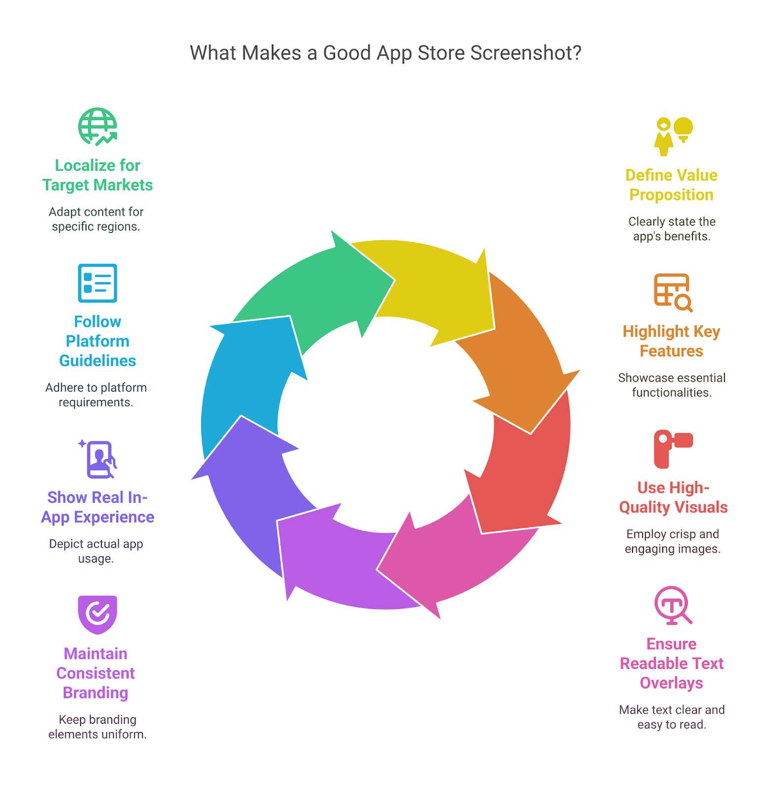
What Makes a Good App Store Screenshot?
Great app store screenshots do more than just look good—they communicate value, build trust, and encourage users to download. Here are the key elements that make a screenshot effective:
Clear Value Proposition – Show users what problem your app solves or what benefit it offers—right from the first screenshot.
Highlight Key Features – Focus on your app’s top features or use cases. Each screenshot should tell a part of the story.
High-Quality Visuals – Use crisp, high-resolution images. Avoid cluttered or pixelated screenshots that could hurt credibility.
Readable Text Overlays – Add short, bold text to explain what users are seeing—make sure it’s legible even on small screens.
Consistent Branding – Use your brand colors, fonts, and style consistently to build recognition and trust.
Show Real In-App Experience – Use actual screen captures (with light design enhancements) to keep things authentic and relatable.
Follow Platform Guidelines – Design with App Store (iOS) and Google Play (Android) requirements in mind—like aspect ratios, orientations, and screenshot order.
Localized for Target Markets – Translate text overlays and adapt visuals for different regions to connect with local audiences.
App Store Screenshots Guidelines
Like any other ASO strategy, your app store listing must align with Google and Apple’s app store requirements for best results.
App Store vs Google Play Screenshot Specs (2026)
Spec
Apple App Store (iOS)
Google Play (Android)
Number of screenshots
1 minimum, 10 maximum (per device type)
2 minimum, 8 maximum (per device type)
File format
PNG or JPEG (PNG preferred for text)
24-bit PNG (no alpha) or JPEG
Colour space
RGB
RGB
Max file size
No fixed limit (high-res required)
8 MB per screenshot
Recommended phone size
6.9″ iPhone: 1320 x 2868 px (portrait) / 2868 x 1320 (landscape)
1080 x 1920 px (portrait) is the standard
Tablet size
13″ iPad: 2064 x 2752 px (portrait) / 2752 x 2064 (landscape)
7″ & 10″ tablet slots, same 320–3840 px rule
Dimension limits
Exact per-device pixel sizes (App Store Connect)
320–3840 px per side; max 2:1 aspect ratio
Content rules
Every screenshot must show the app in use
Text/taglines within ~20% of image; no performance claims
Note: Apple uses the 6.9″ iPhone and 13″ iPad as the primary slots — if you don’t upload them, Apple scales screenshots from those sizes down to smaller devices. Always confirm exact per-device sizes in App Store Connect, as Apple updates them with each new device generation.
Best Practices for App Store Screenshot Optimization
Good app store screenshot design follows a repeatable system, not guesswork: research what works in your category, lead with your strongest value proposition, keep captions to five words a line, and design each frame as part of a single story. The seven practices below take you from competitor research through testing and localisation – apply them in order for the biggest conversion lift.
1. Perform competitive research
The first step to take is understanding what is currently in the market, what works and what doesn’t. Take a look at what your competitors are using as screenshots. You can’t show an app comparison in your listing, but you can find out what the competition looks like and focus on your point of differentiation.
Create a whiteboard and add to it screenshots from at least three of your competitor apps together.
Deeply analyse the value proposition each competitor is claiming and the text that goes with it. Is your offering better? Is there a way to improve your existing offering?
Read user reviews for your competitors to find out what users like and dislike about them. This will show you gaps in the market and help you create a stronger value proposition.
2. Understand the right order for your app screenshots
Only about 9% of app users go through all the screenshots you share. Most of them don’t look past the first three or four. This does not apply to gaming apps. Make sure you communicate the most important information for your customer within the first three or four screenshots. Save all the new features, add-ons and new updates for the end of the screenshot carousel.
You should also ensure that the text is in a large enough font for readers to read without having to zoom in. Don’t make any sentences longer than five words per line.
3. Craft a story
Your screenshots cannot be generic or random. Make sure your screenshots tell a clear story about what your brand offers. Use the first frame to call out your key benefits and use the following screens to qualify your offering.
If your app is within a space with multiple competitors, it helps to use similar imagery as your competitors while calling out your proposition or unique offering within the copy. When you publish an app on Play Store, crafting a visually compelling screenshot sequence can improve user engagement and encourage more downloads. If your app concept is unique and new, call out your messaging in as few words as possible. Not only is this easier to read, but if you can capture your brand’s essence within a few words, it helps build recall and awareness and users retain your app’s details for longer periods.
4. Understand portraits vs landscapes
When it comes to choosing between landscape or portrait-style screenshots, there is no single right answer. It will usually depend on whether your app is primarily designed for desktop or mobile and the usage style of the app. Portrait style apps are the more popular choice as many apps are created for vertical usage on an upright mobile device. However, using a landscape-style screenshot can also create a lasting impression, as seen by Netflix or Call of Duty.
5. Perform rigorous A/B testing
Picking the best app screenshot layout and design cannot be random. Make sure you test enough options to find which one works best in terms of grabbing attention and driving conversions on the different app stores.
Both Google and Apple stores offer various ways to perform A/B testing using multiple versions of app listings, which includes screenshots. When combined with a well-planned deep linking strategy, this can help create a seamless user journey from discovery to in-app engagement. Experts highly recommend using different screenshots during A/B testing processes as well as multiple placement orders for these screenshots to understand which one gives the best results.
6. Localise all app screenshots
Like your search engine and app search metadata, make sure you customize your app screenshots hyperlocally for various global markets. If you can provide the same app in multiple languages or if you customize your listing using multiple languages, use screenshots that feature these local languages as well.
Additionally, you should also analyse and test visual designs, since every market has differing perspectives and social norms. Any visuals, demonstrations or illustrations must adhere to local customs and avoid culturally offensive representations.
7. Customise screenshots and image dimensions for different stores
A/B testing and localisation: where the real gains come from
Two practices separate good screenshots from high-converting ones. First, A/B test systematically: both stores support experiments on store listings – Google Play’s Store Listing Experiments and Apple’s Product Page Optimization let you test different first frames, orders and messaging against live traffic. Third-party tools like SplitMetrics and StoreMaven let you test before you ship. Test one variable at a time and let results, not opinion, decide.
Second, localise beyond translation. Adapt text overlays, imagery and even the order of features for each market, and re-test per locale – colours, social norms and value propositions that convert in one country can fall flat in another. Localised screenshots routinely outperform a single global set, especially in non-English markets.
Common Mistakes to Avoid in App Screenshots
Your app store screenshots are crucial in influencing download decisions. A poorly designed screenshot can turn potential users away. Avoid these common mistakes to ensure your screenshots stand out for all the right reasons:
Using Generic Stock Photos – Avoid using stock photos that don’t reflect your actual app interface. Real app screenshots provide a clear, honest preview of the user experience.
Cluttered or Overcrowded Screenshots – Don’t overcrowd your screenshots with too much text or too many elements. Keep it simple and focused on key features to avoid overwhelming the user.
Neglecting to Showcase Key Features – Make sure to highlight your app’s most important features right away. Failing to do so could cause users to lose interest quickly.
Low-Quality Images – Blurry or pixelated images can reflect poorly on your app’s quality. Always use high-resolution screenshots to create a professional impression.
Lack of Consistency – Your screenshots should have a consistent style. Disjointed visuals and mismatched designs can make your app seem unpolished and confuse users.
Ignoring Localization – If you’re targeting international users, don’t forget to localize your screenshots. Translate text and adapt imagery to appeal to local cultures.
Too Much Text – While captions are helpful, avoid overcrowding your screenshots with too much explanatory text. Keep it short, sweet, and to the point.
Not Testing Variations – It’s essential to test different screenshot styles, layouts, and messaging. A/B testing helps determine what resonates most with users.
Not Showing the App in Use – For many apps, lifestyle images (like showing the app in action) can be more engaging than just screenshots of the interface. Users want to see how it fits into their lives.
Not Updating Screenshots Regularly – App screenshots should evolve with your app’s new features and updates. Don’t let outdated visuals linger; refresh them to match the latest version, and re-run A/B tests after major releases.
Align Your App Store Screenshots with Industry Best Practices
Putting in effort to ensure perfectly optimised app screenshots ensures the app store promotes your app to likely customers. These screenshots are the best place to showcase your complete brand, from the app preview video to all your 5-star customer reviews to exclusive in-app benefits and offers. To better understand ASO, get in touch with our industry-leading ASO services team today.
Frequently Asked Questions (FAQs)
How many screenshots can I upload to the App Store and Google Play?
App Store: You can upload up to 10 screenshots for each device type (iPhone, iPad, etc.)
Google Play: You can upload up to 8 screenshots
Having multiple screenshots helps show the key features and user interface of your app to potential users.
What file formats are accepted for app screenshots?
App Store: Supports PNG, JPEG formats.
Google Play: Also supports PNG, JPEG formats.
Make sure your images are high-quality and properly sized for each platform’s requirements (e.g., minimum resolution).
Can I use the same screenshots for the App Store and Google Play?
Yes, you can use the same screenshots for both platforms. However, be mindful that each store has different size and formatting requirements. You might need to adjust the resolution or layout to match each platform's specific guidelines.
What are best practices for iOS app screenshots?
Keep them simple, clean, and showcase the app’s main features.
Use high-quality images and ensure they align with your brand.
Use vertical images (portrait) and consider adding short text captions to explain features.
Ensure the first screenshot is the most engaging, as it's the first thing users will see.
Should I include text in my app screenshots?
Yes, short and clear text captions can help explain the key features of your app. However, avoid overloading the screenshot with too much text. Focus on highlighting the app’s main benefits in a concise way to make it easy for users to understand quickly
Can I include a video instead of screenshots?
Yes, you can include a video in both the App Store and Google Play as an alternative to some screenshots. It’s often a good idea, as a short video can show the app’s features and functionality in action, making it more engaging than still images.
How do App Store screenshots influence downloads?
App store screenshots have a huge impact on whether users decide to download your app. Attractive, clear, and informative screenshots catch users’ attention and help them understand what the app offers. Great screenshots make your app stand out from the competition and encourage users to click on the download button.
Can I change my app store screenshots after my app is published?
Yes, you can update your app store screenshots anytime after publishing. Regular updates to your screenshots can help keep your app fresh, showcase new features, or align with app updates.
How can I track the performance of my app store screenshots?
You can track the performance of your app screenshots using A/B testing tools like StoreMaven or SplitMetrics. These tools allow you to test different versions of your screenshots to see which ones drive more downloads and user engagement.
Should I design my app store screenshots differently for each platform?
Yes, designing screenshots specifically for each platform is recommended. While the content can be similar, the dimensions, style, and user expectations can vary between iOS and Android. Ensure your screenshots are optimized to look great on both platforms and follow their individual design guidelines.
Sarvesh Bagla is an enterprise SEO expert and industry leader who has driven transformational digital growth for India’s top brands across the BFSI, Healthcare, Automotive, and ECommerce industries. As the Founder and CEO of Techmagnate, he leads large-scale organic search strategies and performance marketing campaigns for businesses looking to succeed in today’s AI-driven search landscape.
A strong advocate for thought leadership, Sarvesh is deeply involved in SEO evangelism and regularly contributes to industry discussions through LinkedIn, webinars, and CMO roundtables. His focus today is on helping brands prepare for an AI-first SEO future (AEO, GEO) and strategies for Large Language Models (LLMs) at the core.
Get the most valuable search related insights about leading brands, trending keywords, search volumes, fastest growing categories, city-level insights and much more!
It has come to our notice that fraudulent job offers are being circulated on the internet through messaging apps like WhatsApp and Telegram, which falsely claim to be from Techmagnate. We take this matter seriously and would like to caution all candidates to be wary of such postings.
Please Note That –
We do not charge any fees/security deposit/payment from candidates, irrespective of the professional experience they hold, for job applications or interviews
Official communication channels include our website and verified social media accounts, primarily LinkedIn.
Kindly double-check the domain name – @techmagnate.com – in the email address
We follow a transparent and ethical approach for hiring/onboarding supported by proper documentation.
Ensure that you only apply through verified channels to avoid being scammed. We also recommend that you exercise caution when sharing personal information or financial details with any job posting or recruitment agencies claiming to represent us.
We want to ensure that potential candidates interested in joining Techmagnate have a safe and positive experience.
If you find that someone that fits the description above has reached out to you, please notify us immediately at jobs@techmagnate.com.
Team @Techmangate
Build a Better Digital Marketing Strategy with Techmagnate’s Search Trends Reports
 Important Alert: